You’re in for a treat today, typography geeks. Today Nerdvana spotlights a logo. You’ve seen it, you know it, you love it, it’s the good ol’ Google logo.
Google THIS!
Originally based on the Catull Typeface, it was later modified in 2015 to Google’s new custom font, Product Sans.
Hangin’ out, hangin’ out, hangin’ out with my font face…
Sometimes there’s brilliance in simplicity, and I think the Google logo exemplifies this. Just simple letters in bright, simple colors. Have you ever wondered why the logo’s colors consist specifically of blue, yellow, red and green? And why just 1 yellow letter and 1 green letter? And why in that particular order?

“I believe it’s a plot of some sort!”
Actually, according to Ruth Kedar, the graphic designer who developed the now-famous logo, “There were a lot of different color iterations. We ended up with the primary colors, but instead of having the pattern go in order, we put a secondary color on the L, which brought back the idea that Google doesn’t follow the rules.” So it would seem that they started with the primary colors (blue, red, yellow) and then added green to be a bit different.
Google’s a rebel, and it’ll never ever be any good!
–Trivia Time: The Google logo also originally contained an exclamation point (!), but it was later dropped, perhaps to avoid confusion with those poseurs over at Yahoo!.
Regular Google users also know that from time to time, Google switches out its’ standard logo in favor of ‘Google Doodles’, specially made variations on the logo (often made by fans or submitted by amateurs) in which the Google letters will take on new forms and identities pertaining to whatever they’re commemorating, but still retaining their basic shape and sometimes the color scheme. 2 recent Google Doodles caught my attention: first, the one for this past New Year’s Eve, 2015. The blue, red and yellow letters became blue, yellow and red birds on a line, while the green L became a green egg that the birds are waiting to see hatch.

“The waiting is the hardest part…”
In a clever touch, Google released this Doodle on New Year’s Eve, and it didn’t change until New Year’s Day, 2016…

…Where the egg hatched into a green…something other than a line bird. The variations were 5 turtles, a green mallard duck and a crocodile.

“Duhh, and a partridge in a pear tree!”
Another recent Google Doodle variant I liked was the one Google did for football season, 2015. In it, the letters become anthropomorphic and unfold the tale of the lower case g’s attempts to join the football squad, inhabited by the other letters.
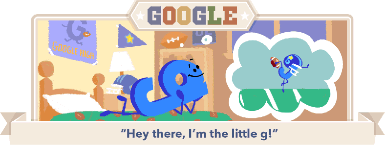


Aw, he thinks they have a bond because they’re the same letter and the same color!

I find it interesting that Google chose to represent the 2 o’s and the e as male and the one l as female, because I read somewhere that all of the consonants are male and the vowels are female. So what does that make Y, exactly?
-For some reason, these 2 Google Doodles remind me of The Amazing World of Gumball…with letters!
